Stay informed
Subscribe to our newsletter if you'd like to stay informed about Shoutem Extensions and Shoutem UI Toolkit.
Shoutem comes with a dozen of available themes, but if you want a custom one, you can write your own. To start, it’s important that you understand two concepts (extension parts):
Note
This tutorial continues on My First Extension. If you don’t have an app which is the result from the My First Extension section, you can find the
Restaurantsextension on Github, install it onto a new app and fill it with some restaurants.
To create a theme within the existing Restaurants extension, switch over to the Restaurants extension folder:
$ cd tom.restaurants
Create a theme and fill it with basic data:
$ shoutem theme add restaurant
Enter information about your theme. Press `return` to accept (default) values.
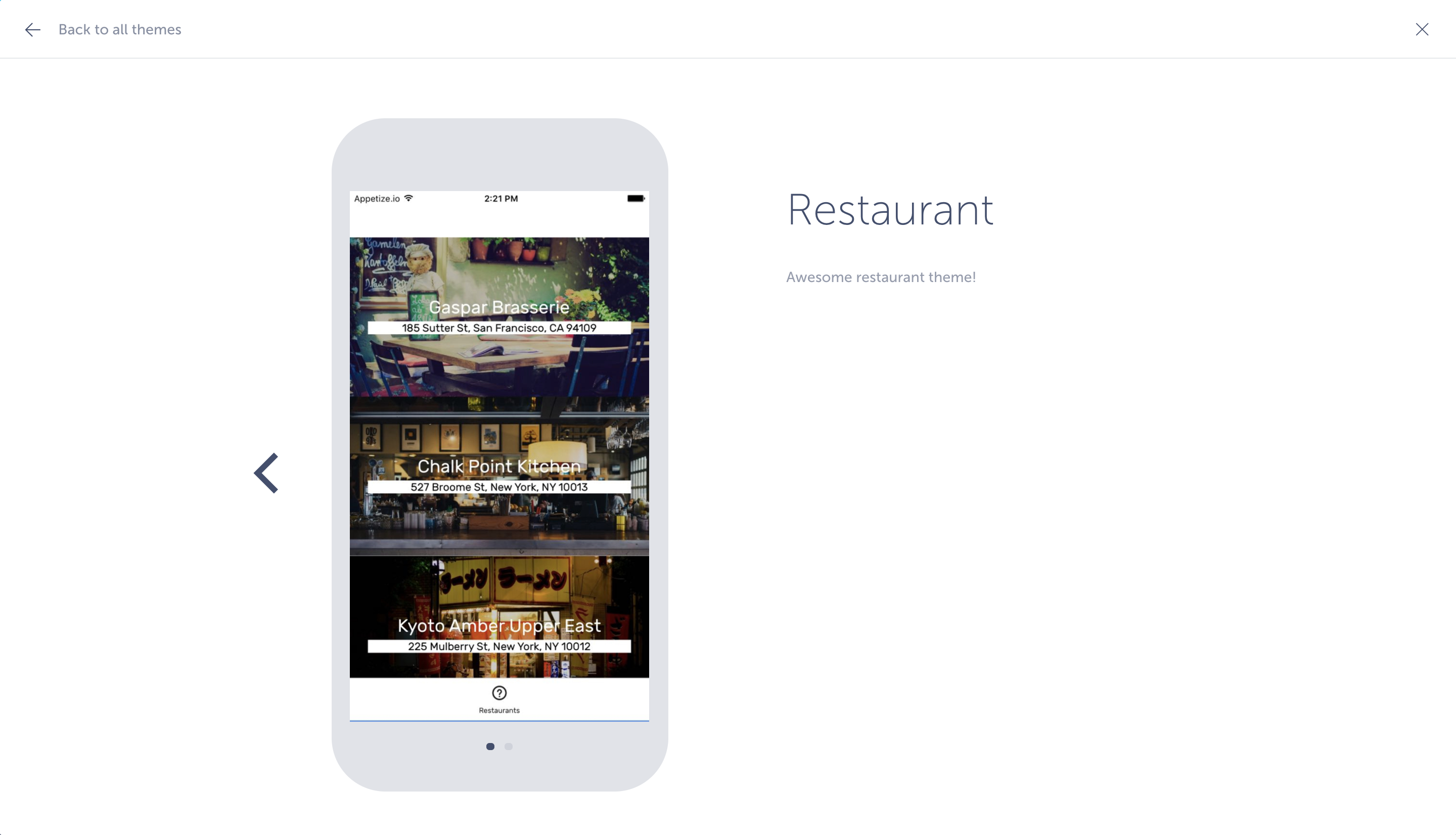
Title: (Restaurants)
Description: Awesome restaurant theme!
File `app/themes/restaurant.js` is created.
File `server/themes/restaurantVariables.json` is created.
The extension.json file was modified to include the newly created theme:
#file: extension.json
{
  "name": "restaurants",
  "version": "0.0.1",
  "title": "Restaurants",
  "description": "List of restaurants",
  "shortcuts": [{ ... }],
  "screens": [{ ... }],
  "dataSchemas": [{ ... }],
  "themes": [{
    "name": "restaurant",
    "title": "Restaurant",
    "variables": "@.restaurant"
    "description": "Awesome restaurant theme!",
    "showcase": ""
  }],
  "themeVariables": [{
    "name": "restaurantVariables",
    "path": "server/themes/restaurantVariables.json"
  }]
}
The showcase property, which is empty, is an array of images and videos that will show off your theme. Download this prepared showcase and copy it to the server/assets folder. Change the showcase property to:
#file: extension.json
"showcase": [
  "server/assets/list.png",
  "server/assets/details.png"
],
As stated above, you can add videos as well to show off your theme.
The CLI also made sure that app/extension.js handles the newly created theme:
#file: app/extension.js
// This file is managed by Shoutem CLI
// You should not change it
import pack from './package.json';

// screens imports
import List from './screens/List';
import Details from './screens/Details';

// themes imports
import restaurant from './themes/restaurant';

export const screens = {
  List,
  Details
};

export const themes = {
  restaurant
};

export function ext(resourceName) {
  return resourceName ? `${pack.name}.${resourceName}` : pack.name;
}
And that our public API, app/index.js, exports the newly created theme:
#file: app/index.js
// Reference for app/index.js can be found here:
// http://shoutem.github.io/docs/extensions/reference/extension-exports

import reducer from './reducer';
import * as extension from './extension.js';

export const screens = extension.screens;
export const themes = extension.themes;

export { reducer };

}
Check app/themes/restaurant.js file. It’s a copy of Shoutem’s default theme - Rubicon.
Push this theme to the Shoutem server. This might take a while, since you need to upload the showcase files too:
$ shoutem push
Uploading `Restaurants` extension to Shoutem...
Success!
Since the Restaurants extension is already installed, so is your theme. However, it’s not applied yet. Navigate to the Styles tab. Currently, the selected theme is Rubicon, clearly no match for your gorgeous new theme, so let’s fix that. Click on the Change theme button. Here you can find every installed theme. Yours is also there! Select it and you’ll see the showcase you set up for it earlier.
Select Apply theme.
Now check the Customize theme tab.
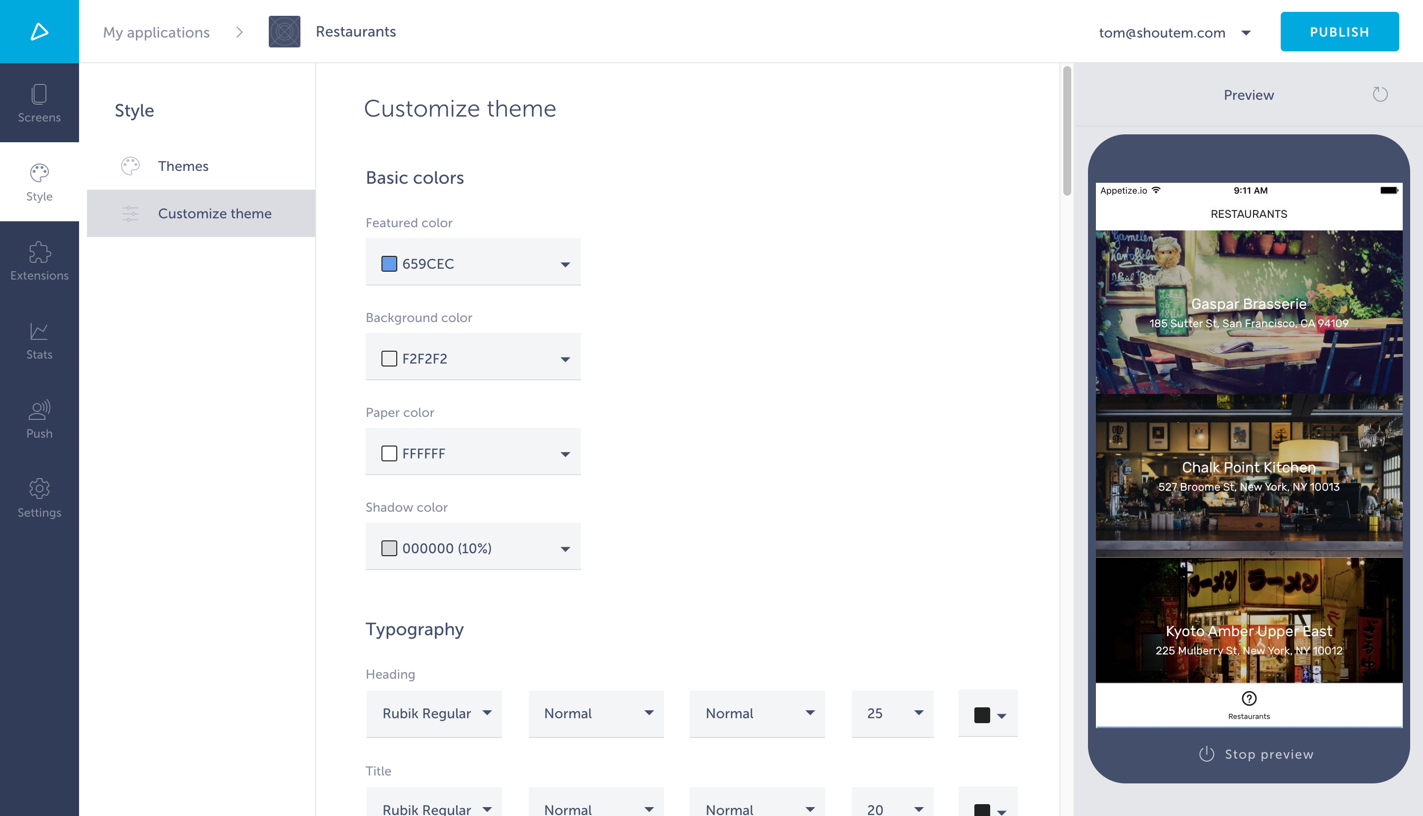
Here the app owner can customize your theme through theme variables. These variables can be found in server/themes/restaurantVariables.json and they’re a copy of the Rubicon theme variables.
A theme is a set of styling rules that customize components in the app connected to the theme, called customizable components. All the components in @shoutem/ui package are connected to the theme so they all share the same style.
The theme file, app/theme/restaurant.js exports the theme function that resolves theme variables and returns theme objects. Theme objects consist of styling rules defined by the @shoutem/theme package. Each component is connected to the theme by the name, by which it can be targeted in theme.
Open app/theme/restaurant.js and check the styling rules used in Rubicon theme. Let’s create a customizable component now.
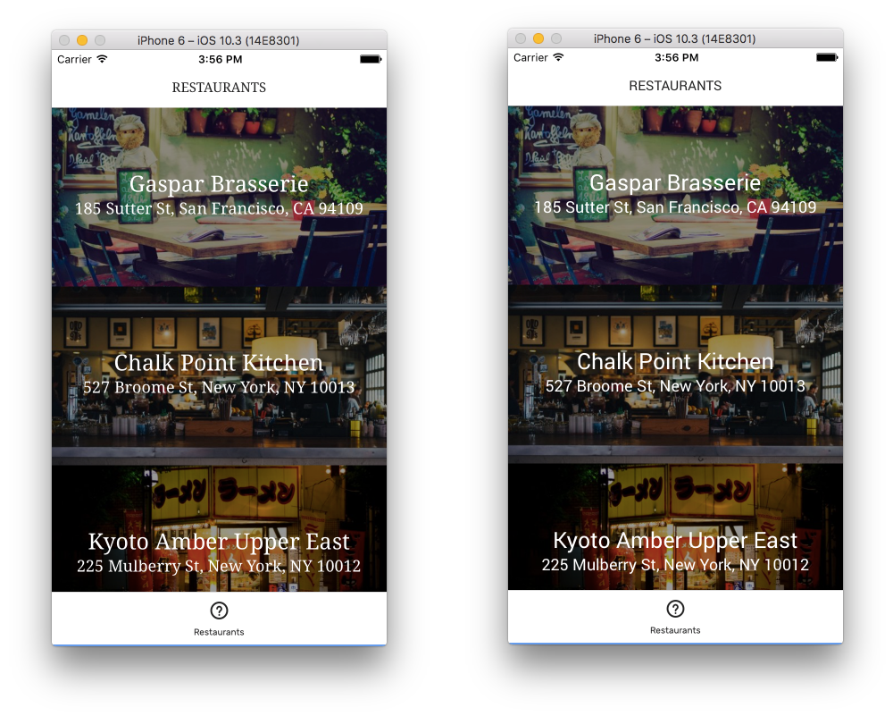
Suppose we want to create a theme which will make the title in restaurant rows bigger and change the background color of subtitles to white, while changing the text color to black. Since restaurant rows are defined in app/screens/List.js we can make that component customizable or encapsulate a separate restaurant row component. Let’s go with the first, simpler solution.
From the docs on how to use @shoutem/theme, in order to support the theme, we need to:
We didn’t use style, but now we’re going to use it from this.props.style in the renderRow method. Also, import connectStyle from @shoutem/theme to connect the component to the theme and assign a name to it.
#file: app/screens/List.js
import React, { PureComponent } from 'react';
import { TouchableOpacity } from 'react-native';
import { connect } from 'react-redux';

import { navigateTo, NavigationBar } from 'shoutem.navigation';

import {
  find,
  isBusy,
  shouldRefresh,
  getCollection
} from '@shoutem/redux-io';
import { connectStyle } from '@shoutem/theme';
import {
  ImageBackground,
  ListView,
  Tile,
  Title,
  Subtitle,
  Overlay,
  Divider,
  Screen
} from '@shoutem/ui';

import { ext } from '../const';

class List extends PureComponent {
  constructor(props) {
    super(props);

    // bind renderRow function to get the correct props
    this.renderRow = this.renderRow.bind(this);
  }

  componentDidMount() {
    const { find, restaurants } = this.props;

    if (shouldRefresh(restaurants)) {
      find(ext('Restaurants'), 'all', {
          include: 'image',
      });
    }
  }

  renderRow(restaurant) {
    const { navigateTo, style } = this.props;

    return (
      <TouchableOpacity onPress={() => navigateTo({
        screen: ext('Details'),
        props: { restaurant }
      })}>
        <ImageBackground styleName="large-banner" source={{ uri: restaurant.image &&
        restaurant.image.url ? restaurant.image.url : undefined }}>
          <Tile>
            <Title style={style.title}>{restaurant.name}</Title>
            <Subtitle style={style.subtitle}>{restaurant.address}</Subtitle>
          </Tile>
        </ImageBackground>
      </TouchableOpacity>
    );
  }

  render() {
    const { restaurants } = this.props;

    return (
      <Screen>
        <NavigationBar title="RESTAURANTS" />
        <ListView
          data={restaurants}
          loading={isBusy(restaurants)}
          renderRow={restaurant => this.renderRow(restaurant)}
        />
      </Screen>
    );
  }
}

export default connect(
  (state) => ({
    restaurants: getCollection(state[ext()].allRestaurants, state)
  }),
  { navigateTo, find }
)(
  connectStyle(ext('List'))(List)
);
As you can see, connectStyle takes the same format as the connect method from Redux. Notice that we added the extension prefix to the component name. While not necessary, it’s a good practice to prevent namespace collisions.
Ok, we’ve added style from theme to the component, but we haven’t implemented those styling rules in the theme, so lets modify our theme.
We created a theme file (app/themes/restaurant.js) with a Rubicon template. Since a Shoutem app can only have 1 theme applied at a time, it’s a good practice to include styling rules for the components usually used in Shoutem extensions, such as the ones from @shoutem/ui.
The theme file is huge and it won’t be pasted into the code snippet here fully. Just search for the export default statement which exports theme functions. In return, add the agreed styling rules:
Import the ext function and add the following styling rules to the beginning of the exported object:
#file: app/themes/restaurant.js
// other imports ...

import { ext } from '../const';

// exports and constants ...

export default (customVariables = {}) => {
  const variables = {
    ...defaultThemeVariables,
    ...customVariables,
  };

  return _.merge({}, getTheme(variables), {
    [ext('List')]: {
      title: {
        fontSize: 25,
      },
      subtitle: {
        color: 'black',
        backgroundColor: 'white'
      }
    },
    // the rest of the styling rules...
})
Styling props for Text components are documented in React Native documentation.
Great! Push the extension now.
$ shoutem push
Uploading `Restaurants` extension to Shoutem...
Success!
Now open the app in the Builder preview.

This is good, but what if we got a request from people using our theme that they want to be able to modify subtitle text color? We can do that with variables, so they don’t have to even leave the Builder.
Exposes variables and defines UI editor types to edit these variables.
To enable customization of themes, we use the theme variables schema. The schema was already created when we added the theme to the project. It’s the server/themes/restaurantVariables.json file. We use it to define the UI editor for adjusting theme variables used in styling rules, which gives Shoutem the information about which variables and their formats are being used for the theme. The full schema reference can be found here.
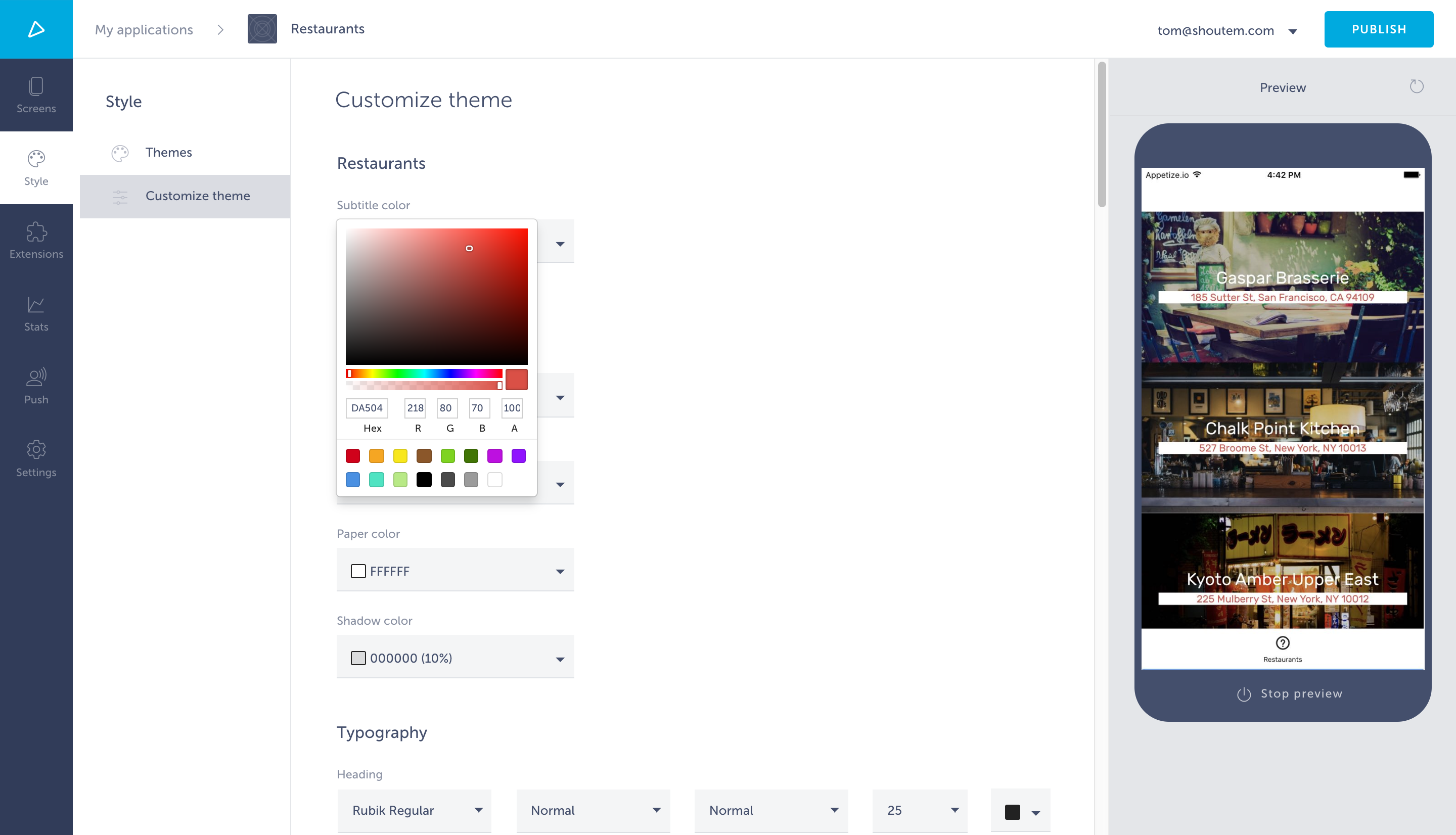
Open the Style tab and choose Customize theme. You can see that theme variables are grouped into sections. Under properties, add a new variable with a color format, where black is the default value. Afterwards, reference that variable in layout.sections so it’s included in the interface. We’ll create a new section for that.
#file: server/themes/restaurantVariables.json
{
  "properties": {
    "subtitleColor": {
      "type": "string",
      "format": "color",
      "title": "Subtitle color",
      "default": "black"
    },
    // other variables
  },
  "layout": {
    "sections": [{
      "title": "Restaurants",
      "properties": ["subtitleColor"]
    }, {
      // other sections
    }]
  }
}
The only thing left to do is to use this variable in the theme file. Again, search for the export default statement:
#file: app/themes/restaurant.js
export default (customVariables = {}) => {
  const variables = {
    ...defaultThemeVariables,
    ...customVariables,
  };

  return _.merge({}, getTheme(variables), {
    [ext('List')]: {
      title: {
        fontSize: 25,
      },
      subtitle: {
        color: 'black',
        backgroundColor: 'white'
      }
    },
    // the rest of the styling rules...
})
You’re done! Push the extension that contains your theme to Shoutem.
$ shoutem push
Uploading `Restaurants` extension to Shoutem...
Success!
Check Customize theme under the Style tab. You can see the Restaurants section with a color picker for subtitle text color. Well done!
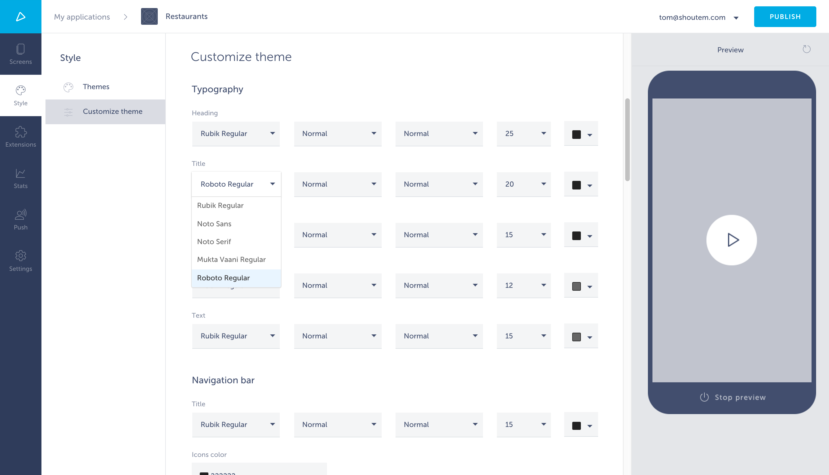
In order to add a custom font to a theme, you’ll have to add a fonts folder to your extension’s app folder and add your custom fonts to it in .TTF format. You can see this structure in our Rubicon theme extension. For the purpose of this tutorial you can use the Roboto font.
These fonts also have to be linked into the app’s binary as assets using rnmp. You do this by adding the following to your extension’s app/package.json file:
#file: app/package.json
{
  "name": "tom.restaurants",
  "version": "0.0.1",
  "description": "My first extension.",
  "rnpm": {
    "assets": [
      "fonts"
    ]
  }
}
Note
In the above code snippet,
fontsis the name of the folder:app/fonts.
In order to be able to choose the font you’ve added through the Builder, it has to also be added to your theme’s variables in the server/themes/restaurantVariables.json file. The custom font we’ve provided you with is called Roboto and we’ll be using the Roboto-Regular version if it.
#file: server/themes/restaurantVariables.json
"fontFamily": {
  "enum": [
    "Rubik-Regular",
    "NotoSans",
    "NotoSerif",
    "MuktaVaani-Regular",
    "Roboto-Regular"
  ]
},
After that, you can push your extension to update the changes you’ve made on the Builder. After choosing your newly created theme you will be able to use the custom font you added:
However, you won’t be able to preview these changes in the Builder. This is because fonts are linked into the binary of the app, while the Builder previews as a predefined binary and only previews JavaScript bundle changes. So to be able to preview this you’ll have to set up your local development environment so the custom font is linked into the local binary. You can find out how to do that here.
Note
If your theme extension is already inside a cloned app for local development, you will have to re-clone the app. Make sure you push all your local changes before cloning again!
Here you can see the difference between Noto Serif (left), a font included in our default theme, and our example custom font Roboto Regular (right):
Icons in the Builder are used to customize your app’s icons in the Main navigation’s different layouts:
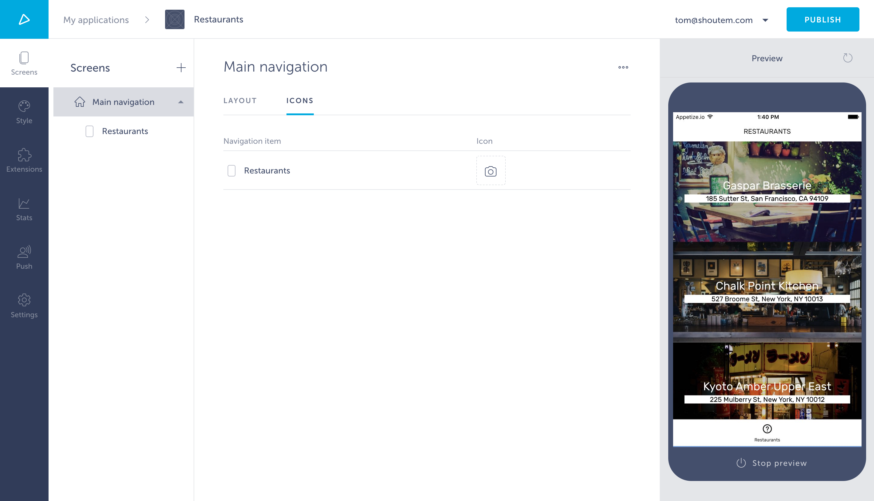
When creating an app, you may want to use your own custom icon for the Main navigation, for instance you want to add a restaurant related icon for your Restaurants extension’s screen.
There’s two ways you can do this:
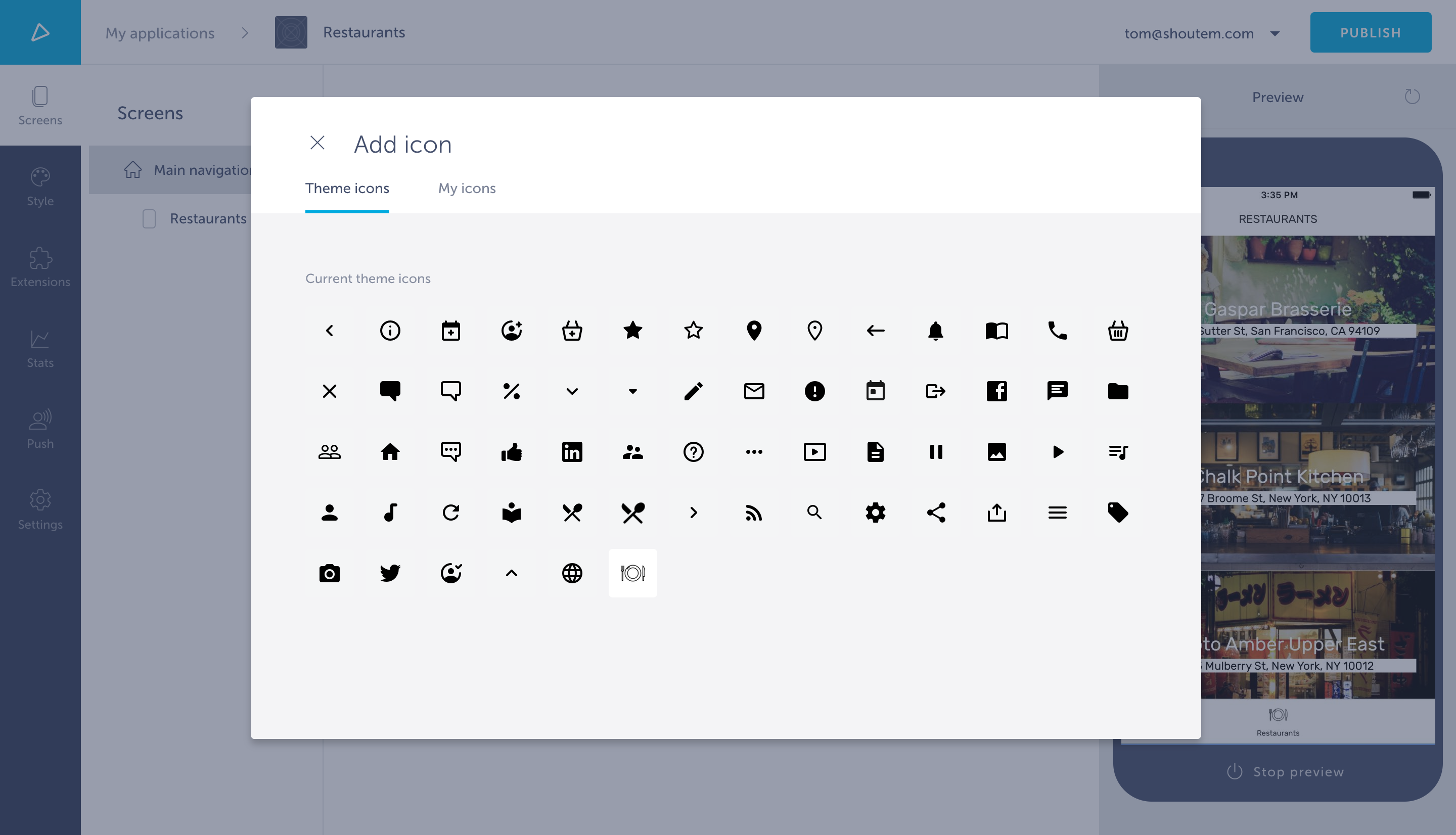
To do this, simply click on the icon you want to change to open the modal window in which you can choose the icon you want to use. You’ll notice there’s two categories: Theme icons and My icons.
After selecting My icons you can see the list of icons you uploaded for that specific app. The disadvantage of using this method is that the icon will only exist for that app, while your extension might be installed in multiple apps.
The Theme icons category refers to the icons from different themes. You can find out which icons are offered in our Rubicon theme here.
In order to add a custom icon to a theme, you’ll have to create a server/assets/icons directory inside your extension’s directory:
$ cd server
$ mkdir assets/icons
And then add your custom icon to it. The reason we use the server folder is because this is utilized by the server side, i.e. the Builder. You can see this structure in our Rubicon theme.
The icon you add should be a .png and 48x48 resolution. In this example tutorial we’ll use the previously mentioned restaurant related icon, a plate and utensils.
After creating the directory and adding your custom icon to it you have to modify the extension.json file to include icons:
#file: extension.json
"themes": [{
  "name": "restaurant",
  "title": "Restaurant",
  "variables": "@.restaurant"
  "description": "Awesome restaurant theme!",
  "icons": "server/assets/icons/",
  "showcase": [
    "server/assets/list.png",
    "server/assets/details.png"
  ]
}],
You can see this in our Rubicon theme.
Now you can simply push to update your extension on Shoutem and once you open your Restaurants app in the Builder and check the Main navigation icons you can see your new icon under the Theme icons category.
The other icons you see are a copy of the icons provided by the Rubicon theme, because, like we said, when you create a custom theme you’re making a copy of Rubicon.