Stay informed
Subscribe to our newsletter if you'd like to stay informed about Shoutem Extensions and Shoutem UI Toolkit.
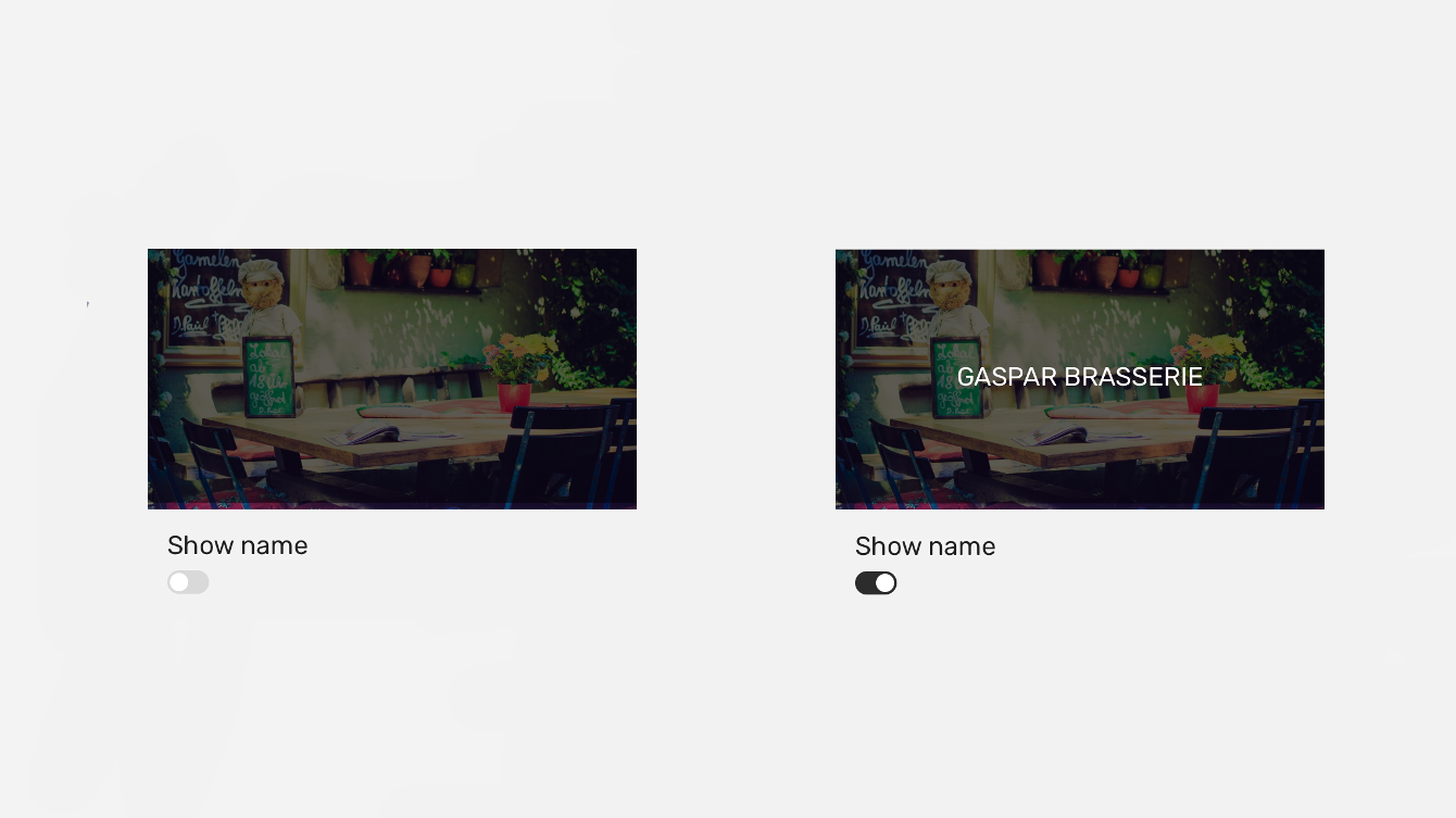
The Switch component can be used to add a simple toggle button.
Switch has no specific style names.
constructor() {
  super();
  this.state = {
    switchOn: false,
  };
}

render() {
  const { switchOn } = this.state;

  return (
    <Screen>
      <NavigationBar
        styleName="inline"
        title="Restaurants"
      />
      <ImageBackground
        styleName="large-banner"
        source={{ uri : "https://shoutem.github.io/static/getting-started/restaurant-1.jpg" }}
      >
        <Tile>
          <Overlay styleName="fill-parent image-overlay">
            {switchOn ?
              <Title styleName="sm-gutter-horizontal">GASPAR BRASSERIE</Title>
              :
              <Title></Title>
            }
          </Overlay>
        </Tile>
      </ImageBackground>
      <View styleName="content md-gutter-top md-gutter-left">
        <Title>Show name</Title>
        <Switch
          onValueChange={value => this.setState({ switchOn: value})}
          value={switchOn}
        />
      </View>
    </Screen>
  );
}